Can you tell I’m a little OCD? Well, I spent the spare moments of my day surveying the world of historical romance fiction in order to try and construct my last argument for why romance authors should consider breaking out of the ‘typical’ romance cover mold.
I think a huge hurdle with trying to persuade them is that authors don’t see what consumers see. Once they’ve got a cover, they associate it with the contents. They know the book is unique because they’ve bloody read the thing. But a consumer has not.
And to consumers, let me show you what they see. I have identified four distinct cover types:


and finally, and most puzzling of all, to me

The point I’d like to make in all of this is – these are what the shelves look like, ladies. Do you want to conform, or do you want to stand out?
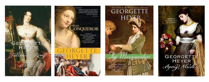
Some notable exceptions were Georgette Heyer, whose covers are always either paintings of the period, or very skilled reproductions
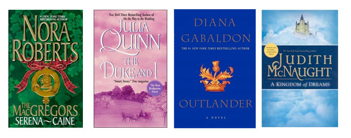
Here are a number of best selling exceptions


I particularly like “The Duchess of Love” cover which seems to have taken inspiration from Angelina Jolie’s leg’s red carpet appearance at the Oscars and transposed the “bored cats in porn” meme to West Highland Terriers, with added tiara. In general I’m rather terrified by the decapitation practised in the genre.
In more seriousness, I think there is a lack of imagination in book covers across all genre fiction, the shelves of my local bookshop look depressingly samey in terms of the covers for crime / thrillers or chic-lit or any other genre.
But as I think you’ve discussed previously, how often is the author consulted? The publisher uses the tried and tested formula to appeal to a tried and tested audience, how do authors challenge that with their publisher?
Oh, RG, I should know not to drink anything while reading your blog. My keys are now sticky, but I swear it’s coffee this time. I am also trembling in my wee booties, for fear you’ll come and critique my covers after I admit that mat least one of my publishers gives me a great deal of latitude in my designs, and the other one thinks I’m an anal witch. Yet I must admit, your posts on the topic shall absolutely have me thinking in new directions from this point forward 🙂
Hey, I really don’t want to pick on anyone. And I’ve tried not to show too many by any single author. Very often, it’s not even their choices. And there is a lot of market pressure for them to conform, when it is their choice.
Ack! Forgot to note how awesome your meme names are. Well done.
giggle
I’ve been told that covers such as you list are what sells. I have to wonder if they sell because of the cover or despite them, in the sense that it’s what’s available. If a cover is supposed to grab your attention, how can it do that if it looks like every other cover?
I actually don’t like pictures of people (although I do like people!) on my e-books. I don’t mind silhouettes or a figure in the distance, but when I had my ebooks up, none had anything like what’s above. And I liked it that way. So, thankfully, did my former publisher.
I think you hit the memes on the head, though. Nice selection. 🙂
More than anything, I think these covers show exactly how the publisher views these books – as product. So the reader is being told “this story will give you exactly what a romance novel is supposed to. But so will this one… and this one… and this one.”
In the traditional publishing world, authors have zero control over their covers. Groaning about covers is almost a right of passage. But I see the mistakes of the past being carried forward into the future with indies and epublishers of romance and erotic romance, most noteably the “look out behind you” meme, but with really bad poser art that screams “unprofessional.”
Writers can bitch and moan as much as they want that cover art shouldn’t matter, but it does, so get over it and do it right if you have some say in the cover. If you don’t have any say in the cover and the publisher is treating your book like product, maybe you aren’t with the right publisher. Or maybe you have a zipper fetish.
Some of those “Pec’s Ahoy” covers I have always thought of as “Munch, munch” covers. As in here is my “insert body part” so go ahead big strong alpha male and eat it. (snickers) Then there is the “Pull Away” or “Oh, no you didn’t” covers. Gotta love those because she is always looking back longingly as some overly steriodized male is yanking her limb out of socket. Or, My all time favorite is the “The back bend from hell” cover where the women is bent backward at an impossible angle while the male looms over her, and she either dangles helplessly or hangs on for dear life. Sometimes I wonder when they do Romance covers if they think we are really that dimwitted.
K. A. Burton
Ye, authors rarely have a say on their covers. Of these styles some love them, some hate them. They are however markers to readers. When someone picks up a book with an extravagant dress and long flowing locks, they know they are getting a particular type of book, something they are familiar with and want to read. In some romance writing circles these are cult classics and subject to a lot of hilarity ala the Smart Bitches. But I think the tide is turning with publishers realising that consumers don’t necessarily like these covers and are embarrassed to be seen reading them in public. Of course some readers love them and revel in them. I’m always bemused by the covers of one of my favorite historical romance writers Loretta Chase who usually writes witty rather sardonic books. I’ve never seen a cover of hers match the content.
I love witty and sardonic. I shall look out for her. And what a shame that her covers don’t have the same qualities!
You wrote a discussion before about people reading more Young Adult novels (which have tons of romance usually). I’ve noticed that the covers of Young Adult novels are *usually* different than adult books in an eye catching way. They do sometimes have people on them, but if you look, they are much less embarrassing to hold. You were talking about abstractions, well, a lot of young adult novels definitely have that too rather than focusing on people. When there are people on the covers, there is something interesting and less “bodice ripper” about them. Maybe this could be a factor as to why people are reading so much Young Adult Romance? Just a thought.
Do you think this will change the more readers get their books on Kindle or i-pad?
cocktailswithdionysus.blogspot.com
RG, I enjoyed this and had a good laugh over your descriptions. Maybe some of the authors feel they won’t be seen, without the formulaic cover, perhaps?
(But I must admit…it is all about THE Dress!) *grin*