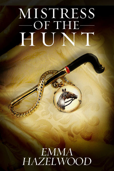
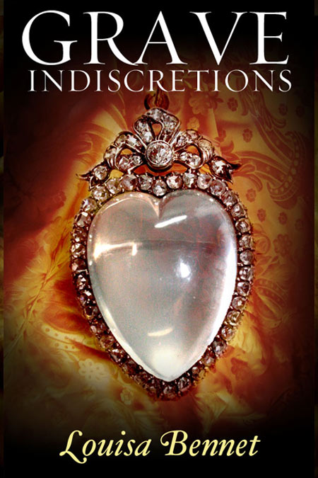
A couple of historical romance authors challenged me to offer an alternative to the ubiquitous ‘girl with a flounce’ covers on most historical romances.
Doing this right would involve paying my father’s old friends in the antique business a visit – I could only work with what I could find lying around on the web. The interesting thing about the early 1800s is that they had some marvelous trinkets – very personal, very intimate items like chatelaines and necessaires for ladies, beautiful toilet sets, ivory carved dance card cases, etc. They also had some wonderful silverware at table, like sugar snips. Plus beautiful textiles. There are also some gorgeous engravings and maps surviving, not to mention outstanding paintings. And, of course, there are surviving English landscape and architecture that is period. So there is a lot to work with, but if I was going to make a living at this, I’d be taking some trains and my SLR and getting a collection of good, relevant stock photography.
Nevertheless, in a pinch, I have taken my cue from Sarah Waters’ delightful book designs, which speak volumes to a later Victorian period. Darkened edges, poignant artifacts, and typography that suits the period. I used Perpetua, Sanbon, and Jensen. All transitional fonts that were first crafted in the late 18th century and early 19th. The items I used were jewelry circa 1830.
Again, they aren’t brilliant covers. But they’re good covers. They’re not cliche, they won’t get lost amidst the frilly women and shirtless men, and no one is going to be able to make snap judgements on what these books contain.


I love the idea of removing the shirtless man and his clueless prey from romance covers in general – I much prefer a book I can carry around without embarrassment. Sadly, after doing some on the ground research, sales were substantially lower for the less obvious covers (although I refuse to go with them for my own books, at least). The reason they are so prevalent is they sell themselves, and not all readers want to look beyond the obvious.
No, this is absolutely true. I think there are probably two reasons to break the formula of romance covers: One, because you are a very successful author who readers already know, and will buy, but you’d like a wider audience. Or two, because you’re like E.L. James. You are new, and you want to enter the market from another angle. When FSOG came out, it wasn’t the erotica world who knew about it first.
Those are books I would buy for their covers. This is how I like them to be presented. Nice job ! 😉
Wow! Thanks. They didn’t go down very well with most romance authors, though.